Riso Researches
For a secret project
Size: Multiple
WIP — Personal project
All printed in risography
Spring 2025
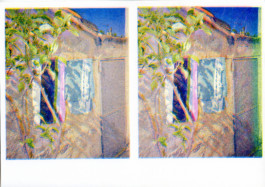
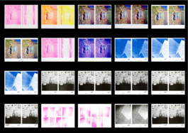
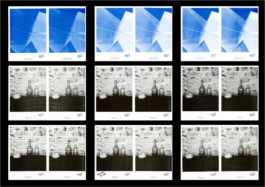
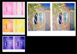
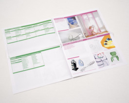
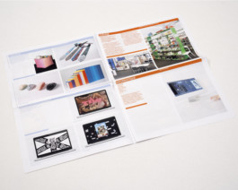
🍉 Riso researches done for a form of experiments for a future project (still a secret).
🪼 The aim would be to print a riso guide once it's more deepen. What are the limits of the printer? How to push it forward?
Calendar 2025
Illustration & Layout
Size: Adapted A4
Personal project
Printed in risography
Autumn 2024
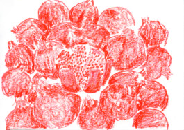
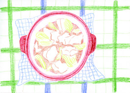
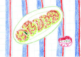
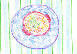
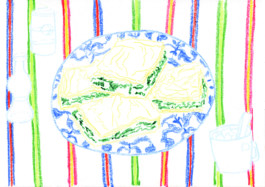
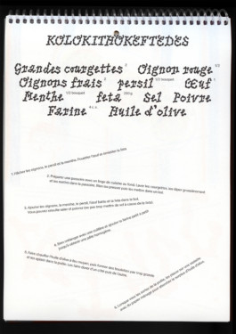
🦀 During Summer 2024 I travelled to Greece.
🍉 I ate a LOT.
🐈⬛ So I made a project about it, a calendar/ cookbook with Greek recipes.
The illustrations are drawn with Neocolor
Best of Foundation year
Editorial
Size: Tabloid Newspaper
For ECAL, Lausanne
Summer 2024
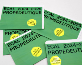
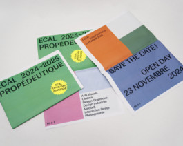
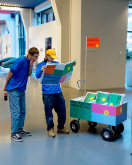
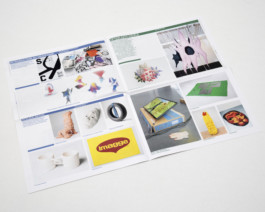
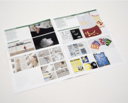
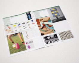
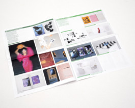
🟡 Newspaper based on students' project at ECAL in Foundation year.
🤸🏼♀️ My aim was to share the works in a colorful and playful way.
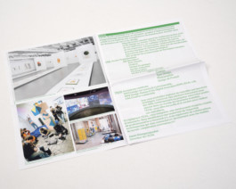
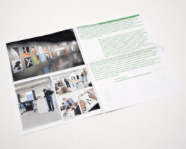
🧃 Showing a maximum of images in pictures to diversity.
Workshop with Highschools
Editorial
Size: 160 x 240 mm
Spring 2024
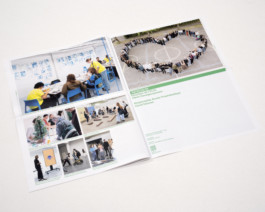
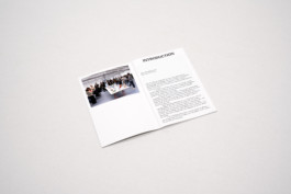
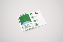
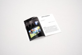
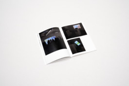
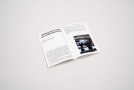
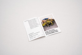
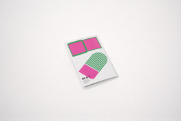
Small documentation about the workshops given by/at ECAL to Highschool's students. Its aim is to inspire the next generation to come at ECAL for creative studies.
VAC'ZINE
Editorial, Photography
Size: 160 x 240 mm
Created by four hands
Handmade binding
Autumn 2023
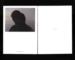
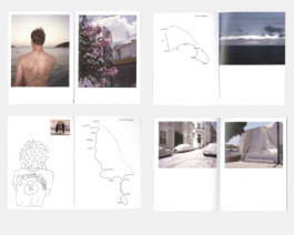
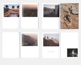
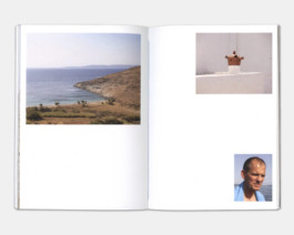
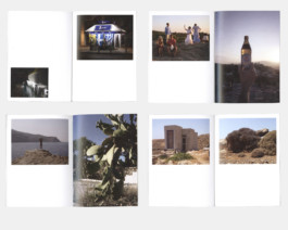
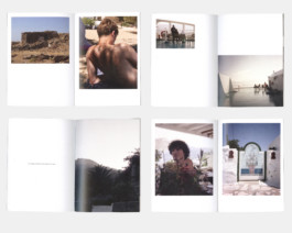
⛱️ Vac'zine is an editorial project, initiated on my own, between a holiday's book and a fanzine.
🇬🇷 The aim was to share our vision and discoveries from our vacation in Greece.
🐠 With a critical point of view of tourists and their relationship to their phone/own image.
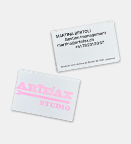
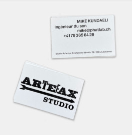
VISIT CARD FOR ARTEFAX
Identity, special print
Size: 88 x 55 mm
Logotype designed by the client, printed by stamp
February 2024
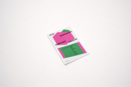
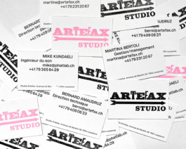
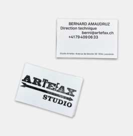
Artefax is an association focus on music and recording. The layout is inspired by music score and the informations become like musical note.
To make the logotype more contemporary and a bit more punk, I used flashy color stamp. 🎼
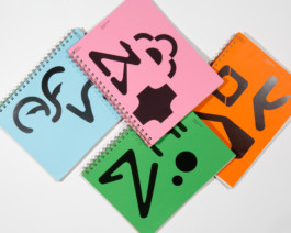
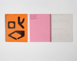
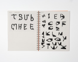
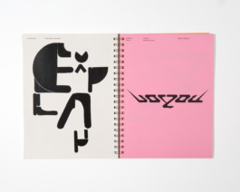
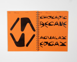
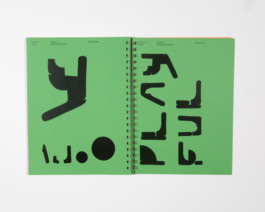
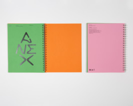
MODULAR EXPRESSION
Editorial, Workshop teaching assistant
Size: A4
Four different covers
February 2024
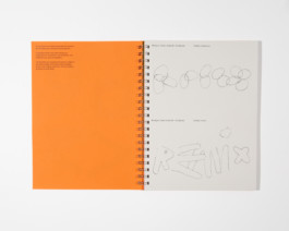
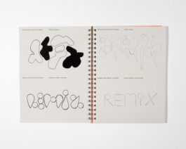
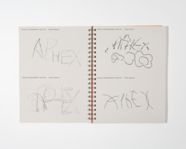
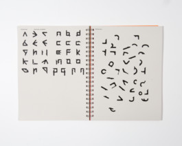
💙 Workshop lead by Clemens Piontek with the foundation year's student in option Graphic Design.
💚 The students had to create a modular typography based on Clemens' typography Vevey.
❤️ The result is a workbook with 4 different colors, and a wall with posters.
🧡 I helped Clemens from the conceptual aspect of the workbook, to the prints, passing by the realisation
FOUNDATION YEAR, ECAL
Workshop
Size: A3
November 2023 +2024
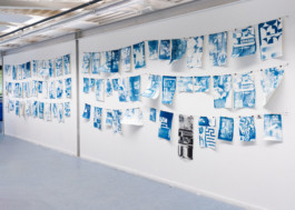
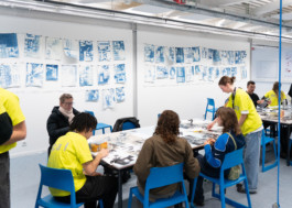
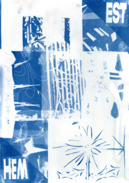
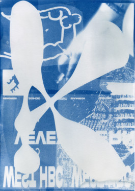
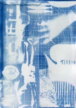
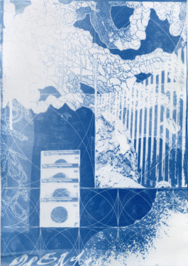
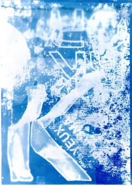
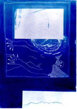
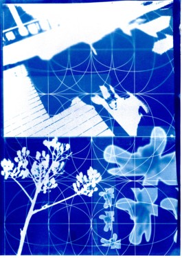
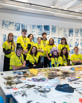
🌀 During the Open Day of ECAL in 2023 and 2024, I had the opportunity to give a workshop of creation of images through the technique of cyanotype. The workshop was lead with the graphic design students and open to the public.
💙 The aim was to leave the computer and to experiment with content of defined images. The important thing is not the quantity of choice but how to play with imposed content.
🔵 Cyanotype is a printing process that allows to highlight mistakes.
FOUNDATION YEAR, ECAL
Posters
Size: A2
2023, 2024
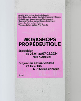
Posters for different event with the foundation year's student.
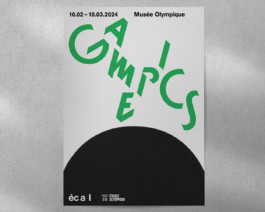
🏓 Gamepics: Photography exhibition at le Musée Olympique de Lausanne, organised by the teacher Nicolas Haeni.
Monaako typography by Altiplano Foundry
🧃 Workshop: Workshops for the six different option courses. The poster uses a mix of visuals created during the week.
More information under my page About
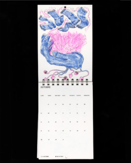
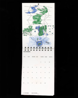
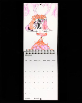
CALENDAR 2024
Editorial, Illustration
Size: A5
Printed in laser and risography
Autumn 2023
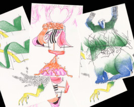
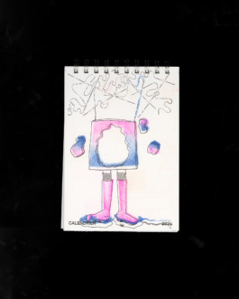
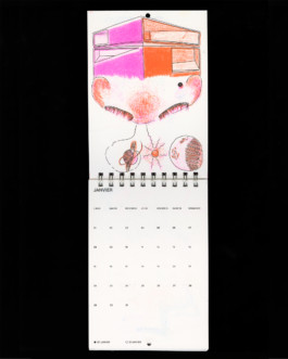
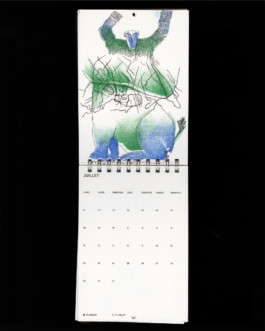
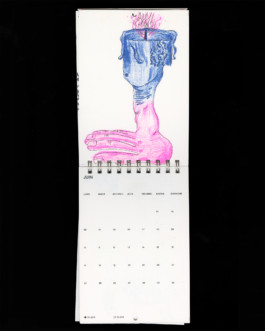
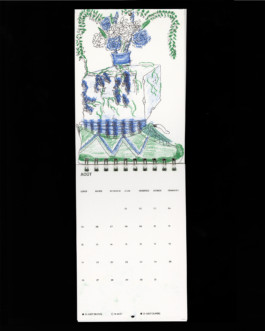
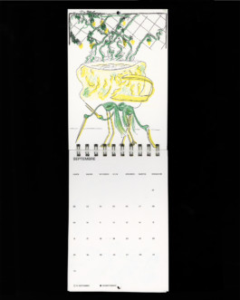
🎠 Calendar drawn by four hand, like cadavre-exquis (by folding the sheet).
➰ We wanted to find a way to draw together without breaking a style or to have to many rules.
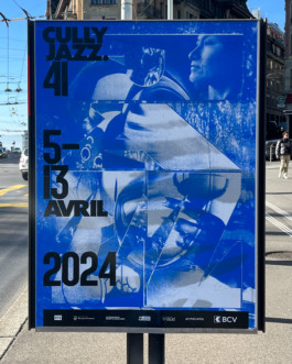
CULLY JAZZ 2024
Poster, cyanotype
F4
Designed by cyanotype technique
Autumn 2023
Collaboration with Carnal Verona studio to design the poster for the music festival Cully Jazz (2024).
As I did my diploma project with the technique of cyanotype, they asked me to help them for the technical part and to create compositions in cyanotype.
🔵 The finals posters are printed in silkscreen.
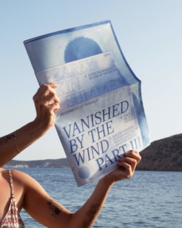
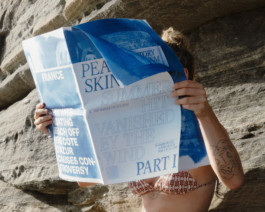
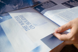
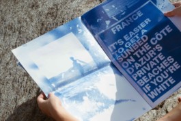
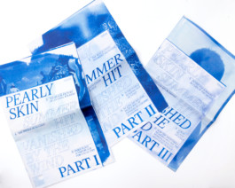
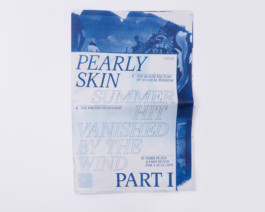
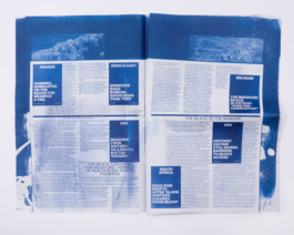
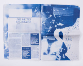
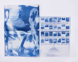
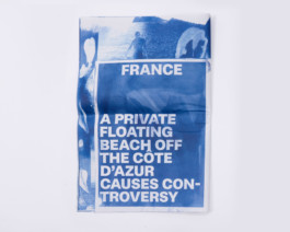
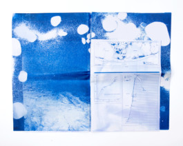
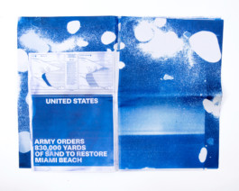
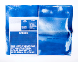
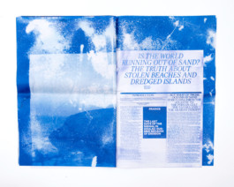
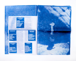
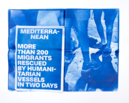
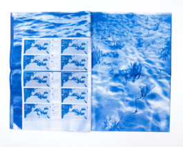
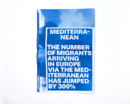
Pearly Skin, Summer Hit, Vanished by The Wind
Editorial, Bachelor Diploma project
Size: Image's part in Broadshift/Text's part in Tabloid
All printed with cyanotype, and then in digital by Newspaper Club
Ecal, Spring 2023
The whole work is about the Beach. Its presence and representation in popular culture. Its dreamlike pictures. The sound of the waves. The imprint of natural elements.
The project, divided into three newspapers, one for each theme -anthropology, climate and migration- juxtaposes dreamlike images, factual news, imperative texts and meaningless advertisings. These different languages emphasise the paradoxical complexity of the place.
In this second chapter « Summer Hit », the newspaper is about the climate changes and how it affects beaches. More specifically it means the disappearing of these places because of erosion, rising waters and sand thefts. The flora and fauna are not spared and run aground…
⛱️ Broadshift newspaper in 3 chapters
⛱️ Printed in cyanotype
⛱️ Fonts: Magister and Rima by Omnitype
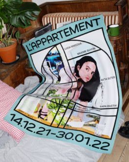
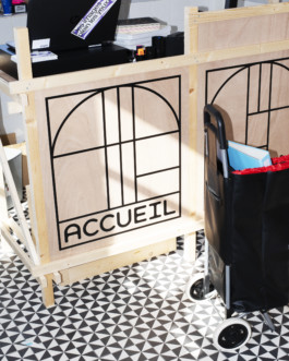
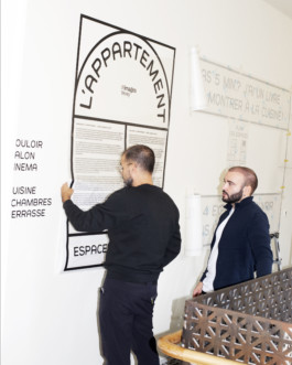
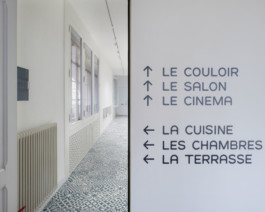
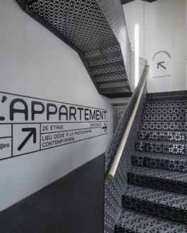
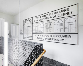
L'APPARTEMENT
Identity, Illustration
Flyer, poster
Custum font designed
Summer 2021 – Winter 2022
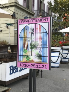
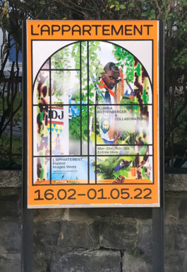
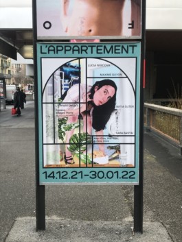
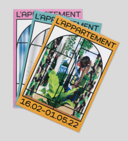
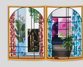
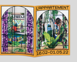
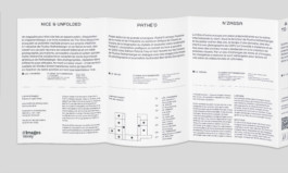
Identity developed in collaboration with Niolas Polli for L'APPARTEMENT, the new exhibition place of Images Vevey. 👀
The idea was to use the place with the different kind of windows as an inspiration for the identity. ⛺️
My role was to develop the identity, draw the custom font and create illustration (digital painting) for the posters and flyers. 🎈
Picture 1, 2, 3: ©Nicolas Polli
Picture 4, 5, 6: ©Vincent Jendly
IL Y A DE LA VIE SOUS LE SOLEIL, ET TOUT NE PIQUE PAS
Editorial
Size: 160 x 240 mm
Font: Garamond
ECAL, Fall 2022
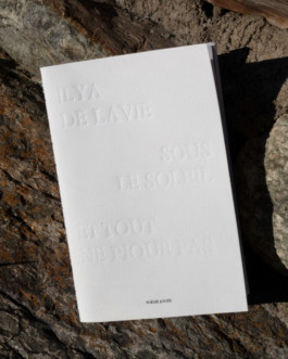
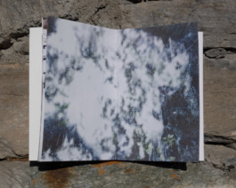
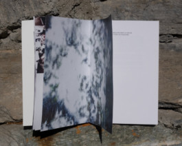
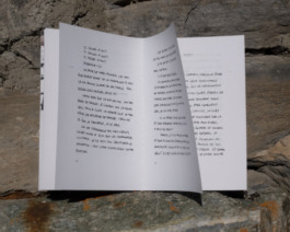
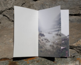
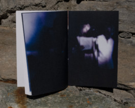
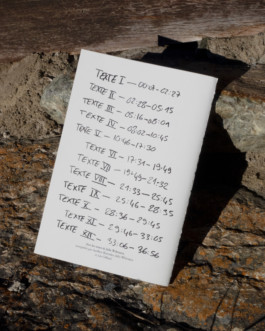
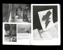
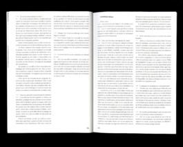
Editorial transcription of the poetic texts’ performance written and played by Julia Widmann, accompanied by Aurélien Batondor and musically by Leo Gilliard. 🌞
The entry and the exit in images represent the process of work: starts by a residency in mountain, the textual work, and finally the performance.
The organic aspect of the «live» and its errors is represented by the manual writing.
The embossed title questions the temporal ambiguity of the texts. Is it past, present, futur? 🌀
XENIA
Text editing, Layout
Size: 160 x 240 mm
Ecal, Fall 2022
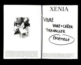
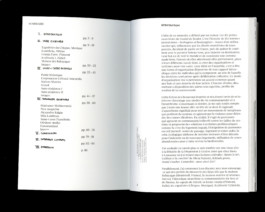
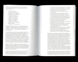
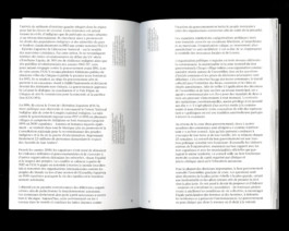
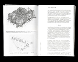
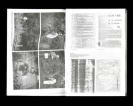
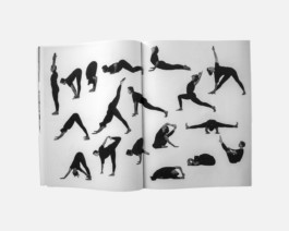
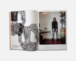
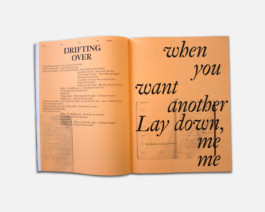
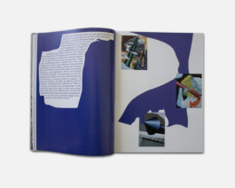
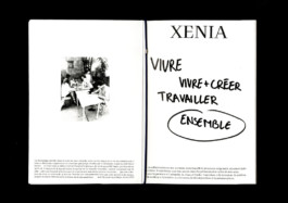
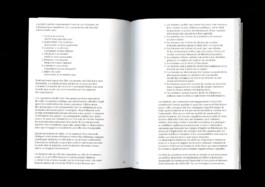
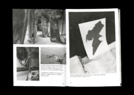
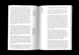
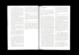
🛠️🛖🍿 Bachelor's thesis about how to live together, to work together and finally, how to do both in the same time?
ADJACENT MAGAZINE
Art direction, Editorial
Size: 210 x 280 mm
ECAL, Spring 2022
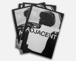
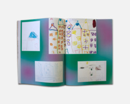
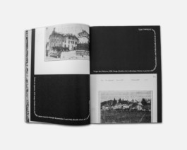
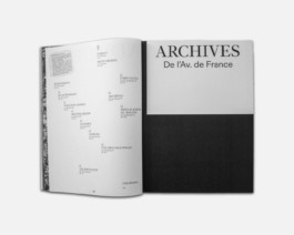
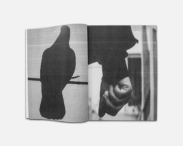
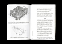
Magazine about local and creative people living in the avenue de France in Lausanne. Creating collaboration between and with them. 💫
The layout plays with the different kinds of contenu, making connections and enlightening each of them.
Realised with 🌞🌞:
Louis Michel and Antoine Woeffray (photographs)
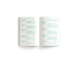
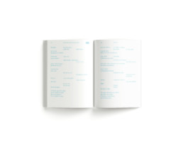
PAISAJES POETICOS
Art direction, Editorial
Size: 100 x 160 mm
ECAL, Spring 2022
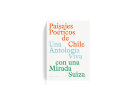
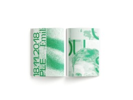
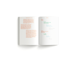
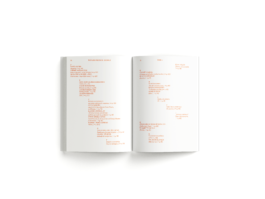
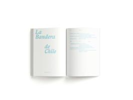
🇨🇱 Project created for the Swiss Embassy in Chile, with poems by local authors, some of them Mapuche.
⛰️ Each chapter of the book has its own language, symbolizing Chile's different (poetic) territories: a variety of colors, landscapes and spaces.
©Aude Meyer de Stadelhofen •
Septembre 2024


Riso Researches
For a secret project
Size: Multiple
WIP — Personal project
All printed in risography
Spring 2025
🍉 Riso researches done for a form of experiments for a future project (still a secret).
🪼 The aim would be to print a riso guide once it's more deepen. What are the limits of the printer? How to push it forward?


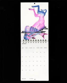
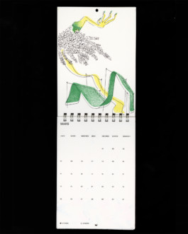
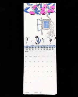
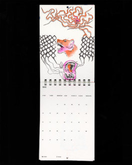
Calendar 2025
Illustration & Layout
Size: Adapted A4
Personal project
Printed in risography
Autumn 2024
🦀 During Summer 2024 I travelled to Greece.
🍉 I ate a LOT.
🐈⬛ So I made a project about it, a calendar/ cookbook with Greek recipes.
The illustrations are drawn with Neocolor


Best of Foundation year
Editorial
Size: Tabloid Newspaper
For ECAL, Lausanne
Summer 2024
🟡 Newspaper based on students' project at ECAL in Foundation year.
🤸🏼♀️ My aim was to share the works in a colorful and playful way.
🧃 Showing a maximum of images in pictures to diversity.


Workshop with Highschools
Editorial
Size: 160 x 240 mm
Spring 2024
Small documentation about the workshops given by/at ECAL to Highschool's students. Its aim is to inspire the next generation to come at ECAL for creative studies.


VAC'ZINE
Editorial, Photography
⛱️ Vac'zine is an editorial project, initiated on my own, between a holiday's book and a fanzine.
🇬🇷 The aim was to share our vision and discoveries from our vacation in Greece.
🐠 With a critical point of view of tourists and their relationship to their phone/own image.
Size: 160x240 mm
Created by four hands
Handmade binding
Autumn 2023


VISIT CARD FOR ARTEFAX
Identity, special print
Artefax is an association focus on music and recording. The layout is inspired by music score and the informations become like musical note.
To make the logotype more contemporary and a bit more punk, I used flashy color stamp. 🎼
Size: 88 x 55 mm
Logotype designed by the client, printed by stamp
February 2024


MODULAR EXPRESSION
Editorial, Workshop teaching assistant
💙 Workshop lead by Clemens Piontek with the foundation year's student in option Graphic Design.
💚 The students had to create a modular typography based on Clemens' typography Vevey.
❤️ The result is a workbook with 4 different colors, and a wall with posters.
🧡 I helped Clemens from the conceptual aspect of the workbook, to the prints, passing by the realisation
Size: A4
Four different covers
February 2024


FOUNDATION YEAR, ECAL
Workshop
Size: A3
November 2023 +2024
🌀 During the Open Day of ECAL in 2023 and 2024, I had the opportunity to give a workshop of creation of images through the technique of cyanotype. The workshop was lead with the graphic design students and open to the public.
💙 The aim was to leave the computer and to experiment with content of defined images. The important thing is not the quantity of choice but how to play with imposed content.
🔵 Cyanotype is a printing process that allows to highlight mistakes.


FOUNDATION YEAR, ECAL
Posters
Posters for different event with the foundation year's student.
🏓 Gamepics: Photography exhibition at le Musée Olympique de Lausanne, organised by the teacher Nicolas Haeni.
Monaako typography by Altiplano Foundry
🧃 Workshop: Workshops for the six different option courses. The poster uses a mix of visuals created during the week.
More information under my page About
Size: A2
2023, 2024


CALENDAR 2024
Editorial, Illustration
🎠 Calendar drawn by four hand, like cadavre-exquis (by folding the sheet).
➰ We wanted to find a way to draw together without breaking a style or to have to many rules.
Size: A5
Printed in laser and risography
Autumn 2023

CULLY JAZZ 2024
Poster, cyanotype
Collaboration with Carnal Verona studio to design the poster for the music festival Cully Jazz (2024).
As I did my diploma project with the technique of cyanotype, they asked me to help them for the technical part and to create compositions in cyanotype.
🔵 The finals posters are printed in silkscreen.
F4
Designed by cyanotype technique
Autumn 2023


Pearly Skin, Summer Hit, Vanished by The Wind
Editorial, Bachelor Diploma project
The whole work is about the Beach. Its presence and representation in popular culture. Its dreamlike pictures. The sound of the waves. The imprint of natural elements.
The project, divided into three newspapers, one for each theme -anthropology, climate and migration- juxtaposes dreamlike images, factual news, imperative texts and meaningless advertisings. These different languages emphasise the paradoxical complexity of the place.
In this second chapter « Summer Hit », the newspaper is about the climate changes and how it affects beaches. More specifically it means the disappearing of these places because of erosion, rising waters and sand thefts. The flora and fauna are not spared and run aground…
⛱️ Broadshift newspaper in 3 chapters
⛱️ Printed in cyanotype
⛱️ Fonts: Magister and Rima by Omnitype
Size: Image's part in Broadshift/Text's part in Tabloid
All printed with cyanotype, and then in digital by Newspaper Club
Ecal, Spring 2023


L'APPARTEMENT
Identity, Illustration
Flyer, poster
Custum font designed
Summer 2021 – Winter 2022
Identity developed in collaboration with Niolas Polli for L'APPARTEMENT, the new exhibition place of Images Vevey. 👀
The idea was to use the place with the different kind of windows as an inspiration for the identity. ⛺️
My role was to develop the identity, draw the custom font and create illustration (digital painting) for the posters and flyers. 🎈
Picture 1, 2, 3: ©Nicolas Polli
Picture 4, 5, 6: ©Vincent Jendly


IL Y A DE LA VIE SOUS LE SOLEIL, ET TOUT NE PIQUE PAS
Editorial
Editorial transcription of the poetic texts’ performance written and played by Julia Widmann, accompanied by Aurélien Batondor and musically by Leo Gilliard. 🌞
The entry and the exit in images represent the process of work: starts by a residency in mountain, the textual work, and finally the performance.
The organic aspect of the «live» and its errors is represented by the manual writing.
The embossed title questions the temporal ambiguity of the texts. Is it past, present, futur? 🌀
Size: 160 x 240 mm
Font: Garamond
ECAL, Fall 2022
XENIA
Text editing, Layout
🛠️🛖🍿 Bachelor's thesis about how to live together, to work together and finally, how to do both in the same time?
Size: 160 x 240 mm
Ecal, Fall 2022


ADJACENT MAGAZINE
Art direction, Editorial
Magazine about local and creative people living in the avenue de France in Lausanne. Creating collaboration between and with them. 💫
The layout plays with the different kinds of contenu, making connections and enlightening each of them.
Realised with 🌞🌞:
Louis Michel and Antoine Woeffray (photographs)
Size: 210 x 280 mm
ECAL, Spring 2022


PAISAJES POETICOS
Art direction, Editorial
Size: 100 x 160 mm
ECAL, Spring 2022
🇨🇱 Project created for the Swiss Embassy in Chile, with poems by local authors, some of them Mapuche.
⛰️ Each chapter of the book has its own language, symbolizing Chile's different (poetic) territories: a variety of colors, landscapes and spaces.
©Aude Meyer de Stadelhofen •
Septembre 2024